Sun and Clouds

In this project, we learned how to apply some of the skills that we learned from the videos we watched. For example, how to make a compound shape. I thought that the hardest part of this project was the clouds. I couldn't get them to look quite right, and I had to ask for help. I didn't understand the part where we had to overlap them instead of just placing them next to each other, so my clouds look like the bottom peak is too deep. If I were to do this project again, I would probably spend some more time on the clouds and make them look more like clouds. I also had some trouble with the layering, but after doing this project, I think I understand for the most part how they work. I liked how the directions walked you through the drawing step by step for the first drawing so we weren't just on our own for the whole thing. I got confused on how to do the Sun at first, but once you explained it in class, I understood how it worked. I thought this was a fun project, and I enjoyed playing around with some colors when I was done with the design. I thought that the hardest part was the clouds and uploading the file itself, but other than that this wasn't too hard for a first drawing.
Principles Of Design

In the Principles of design assignment, we learned how to create examples for the principles of design through Adobe Illustrator. Something new that we learned how to do was how to show movement in a design. At first, I wasn't sure what to create to represent movement, but after we did the examples in class, I understood how to make the objects look like they were moving. My favorite part about this project was learning about how to create movement. I thought that the example that we did with the star was a really cool feature, and I hope to use it in later designs to spice things up. The only thing that I thought was difficult was remembering how to make the star feature blend in. I couldn't remember how to make my star look like the example we did, so I just applied what we did to make the runner look like he was moving to my star for my movement example. Overall, I liked this project and thought that we learned cool new ways to add on to our designs
Pen Tool

The purpose of the Pen Tool Project was to get us more comfortable with using the pen tool. I think that this project definitely helped make me more comfortable using the pen tool. I think that this was probably the best project that we have done so far. I like being able to choose what we draw. I think that choosing what you do for your assignments makes you enjoy what you are doing more. The hardest part of this project for me was drawing the person. I thought that trying to detail the face was really hard, but once I got the hang of it, It worked out fine. If I could go back and change one thing about my project, it would be putting more detail in the background to make it more interesting, but I was kind of on a time crunch for this one and needed to get things done. But overall, I really enjoyed doing this project and thought that it was really fun.
Typeface
For the Book covers project, we had to find different book covers or movie covers and put them all on a document. Then, we categorized them based on their fonts. This project was to show us how font has an impact on how we look at words. Fonts can help us get our point across. The hardest part of this project was categorizing the book covers based only on their fonts. This wasn't my favorite project that we have done, but it wasn't that bad. I don't think I would change anything about my book covers project.
For the Words project, we had to create words and represent them with the font. I thought that this assignment was better than the book cover assignment. I liked it because there was more creativity. Some of the tutorials were hard to follow or confusing, and that was the hardest part of the assignment. But overall, I liked the Words project better than Book covers project. I wouldn't change anything about my assignment.
For the Words project, we had to create words and represent them with the font. I thought that this assignment was better than the book cover assignment. I liked it because there was more creativity. Some of the tutorials were hard to follow or confusing, and that was the hardest part of the assignment. But overall, I liked the Words project better than Book covers project. I wouldn't change anything about my assignment.
Helvetica
Helvetica should be used by designers as their "go-to-font". Helvetica is a classic style of font that allows the designer to get the message out without being corny or making the text hard to read. Some may argue that using font should add to the message, but I disagree. Trying to add something to the text would take away from it because the text should only be there to deliver the message. Using Helvetica is a way to make the message that you are trying to send look clean and sharp. When you start messing around with other fonts, that is when you lose the look of professionalism. Using Helvetica, you can not only get the message across without any question, but you also make the text look professional.
An example would be ads in a magazine. Before Helvetica was around, people used to use whatever typeface that they thought would make it more interesting when actually, they were only making the ad look distracting and unprofessional. When you compare an ad that doesn't use Helvetica to a more modern ad that does use Helvetica, the difference between the two will be obvious. If you look at the example that I have attached, you will see that the Helvetica font draws your eye with its sharp lines and simply looks better and cleaner, compared to the other fonts.
Helvetica should be used by designers as their "go-to- font" because it simply draws your eye, while looking clean, sharp, and sending the message clearly, as opposed to other fonts
Typeface Webquest and Word Art

|

|
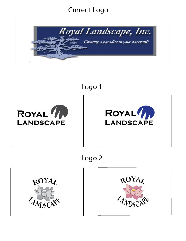
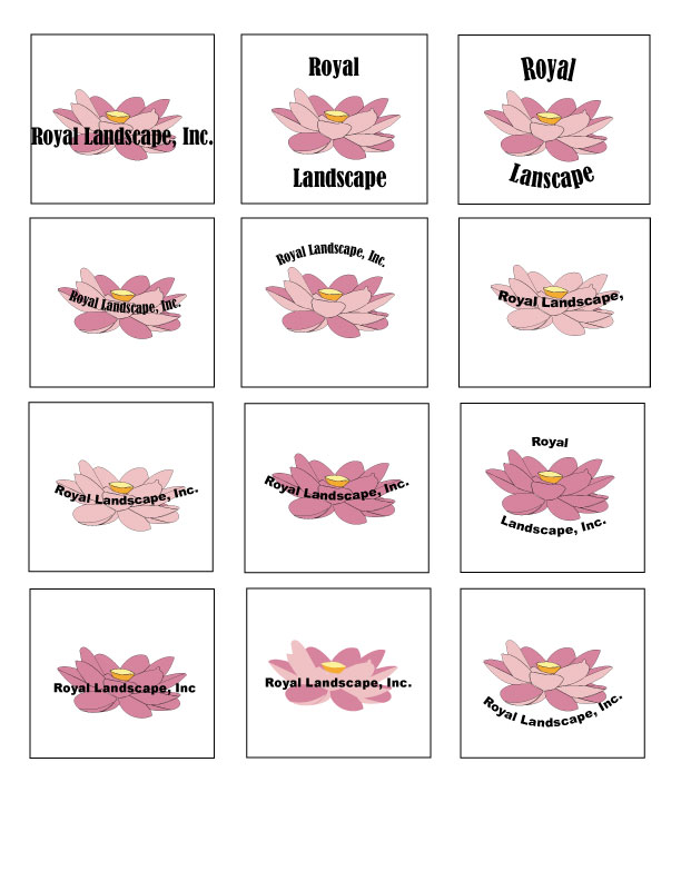
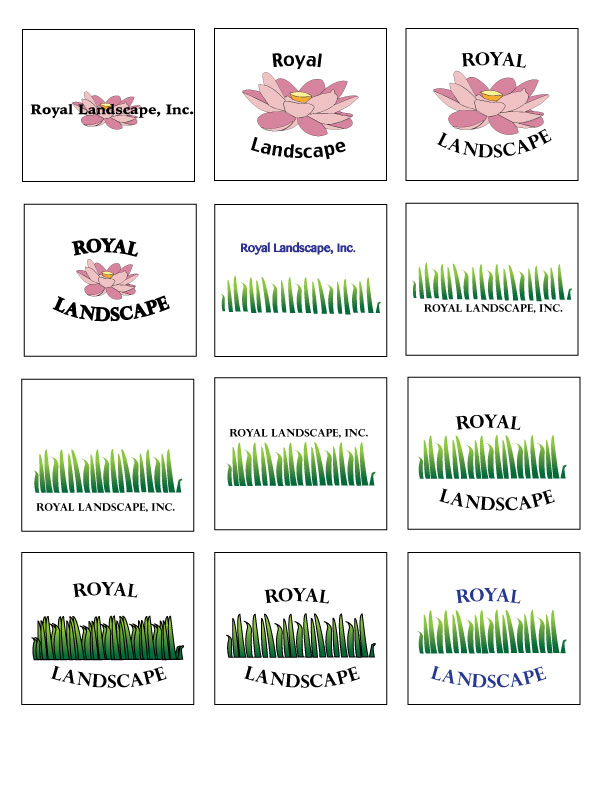
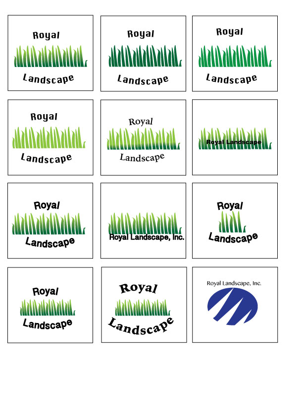
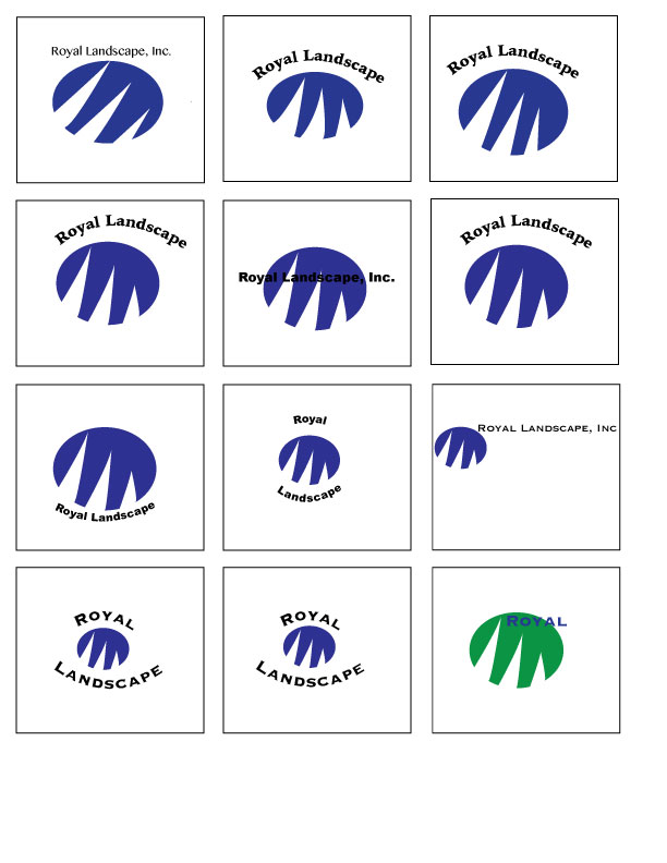
Corporate Logo Design
Many design stages were in progress before the final examples were created.
The purpose of this project was to create a logo for an existing company that was simple, clean and made the company be remembered. For my project, I chose to do Royal Landscape, Inc. Which is basically a landscaping service.In this project, we had to develop 10 sketches, and then pick our best two designs and develop them in the design stage. The design stage takes the most time, and is only finished when you have your best possible product. The skills that were displayed in this project was coming up with ideas and reworking them. I found this to be the most difficult part of the project, coming up with ideas and developing them in the design stage. If given the opportunity, I wouldn’t change anything about my designs, but I would try new ways to work in my other designs and make them better in the design stage. What I enjoyed most about this project was being able to work independently and working at my own pace.
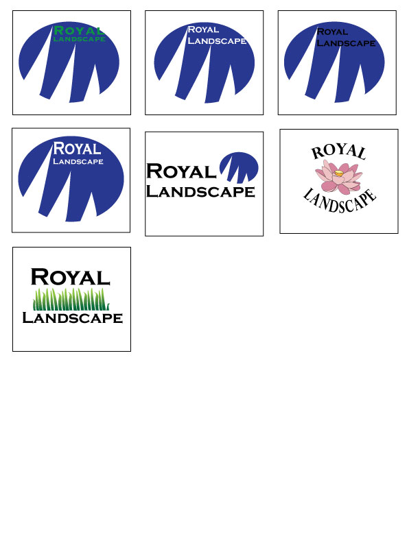
Final product of the Logo Design